Category Suggestions

A data-driven creator tool that provides game recommendations based on viewer saturation in the creator's most recently streamed category.
Real-time data Community Building Data Visualization Content Discovery Recommendation Engine
Category Suggestions

Results & impact

My responsibilities: UX Design and Research Lead

Project timeline: Q3 - Q4 2022, including UXR, design, solution validation, and GA release.

~12%
Increased CTR
10%+
Adoption rate
2M+
Testing sample

The challenge

I really wanna grow but I don't want to bore my community by streaming some super-popular game that I hate just to get views. I just don't know what else is out there that me and my channel would like.
- Twitch Affiliate


The core need: Help creators grow by showcasing games similar to those which they (and their community) love with high viewer 'saturation.'

“Variety Streamers” - or streamers who stream a multitude of games on Twitch rather than focusing on one or two - make up an overwhelming majority of new and up-and-coming creators on the platform. Creators want to stream content that is not only enjoyable and fulfilling to them, but also engaging to their community and beneficial in building a viewer base. Because of this, choosing what content to stream can often be a difficult and stressful process for newer creators.

This experiment aimed to ease that burden by presenting creators with metrics on their most recently streamed game, and similar games that are performing well - in this case, that is defined as having a high average viewer saturation per channel. We sought to answer three questions:

  • Do creators want this feature?
  • Will creators be able to find this feature and understand how to interact with it?
  • Will this module change user behavior - will they take our suggestions?

Design process

1
Research Deep Dive
Scoured through research library to find any existing studies around new and up-and-coming creators and affiliates and their process/needs for growing their community.
2
Data Consult
Worked with a data analyst to understand what data was available for the project. Since the exact data wasn't available, we determined a reasonable proxy.
3
Problem validation
Presented low-fidelity wireframes to creators to gather insight and feedback on our POC for the project, including their degree of familiarity with data analysis and preferences for different types of data visualization.
4
Feasibility Consult
Worked with engineering to understand feasibility for our POC, and built a list of product requirements that accounted for our extremely quick project timeline.
5
Design Sprint
Conducted design explorations for the product, shaped by user feedback from our UXR sessions and engineering feedback throughout the design sprint.
6
Testing & Release
Released the initial version of the product to one-third of all creators, and created a rollout plan for all creators following the experiment's success.

Research & discovery

Creator Interviews

One of our main constraints for this project was time - we only had a few months to fully prove the POC - so I scoured existing research in this area to glean creator needs when starting and growing their channel, and viewer sentiment around 'community.' We were able to build a solid foundation for this project based on the insights contained in this research, while still maintaining our strict timeline.

Key Findings

Creators on Twitch stream a gamut of content, including many non-gaming categories, but we decided to focus on gaming content specifically for the following reasons:

  • 99.8% of new creators on Twitch stream gaming content first
  • The largest segment of Variety Streamers - defined by streaming 3 or more categories in the past 30 days - was comprised of the following:
    • 66% new creators
    • 78% of new Affiliates (creators who are in the first phase of monetized content on Twitch)

My solution

Data Consult

Another key constraint had to do with the data feeding our system; we were unable to build any new services, nor could we change any existing ones. Since "Viewer saturation" didn't already exist in our microservices, I sought the expertise of our data science team to find an effective proxy. Through these conversations, we arrived on a ratio of number of viewers per live channels by category, or Viewers:Channel.

Problem Validation

Following a short design sprint, we conducted a round of problem validation with the initial concepts and asked active creators for their feedback on it. These concepts included items with data visualization, education cards, table views, etc. in order to understand the best way users were able to interpret this information.
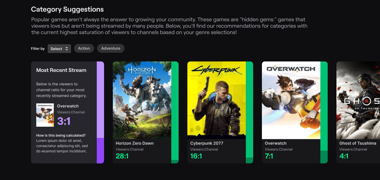
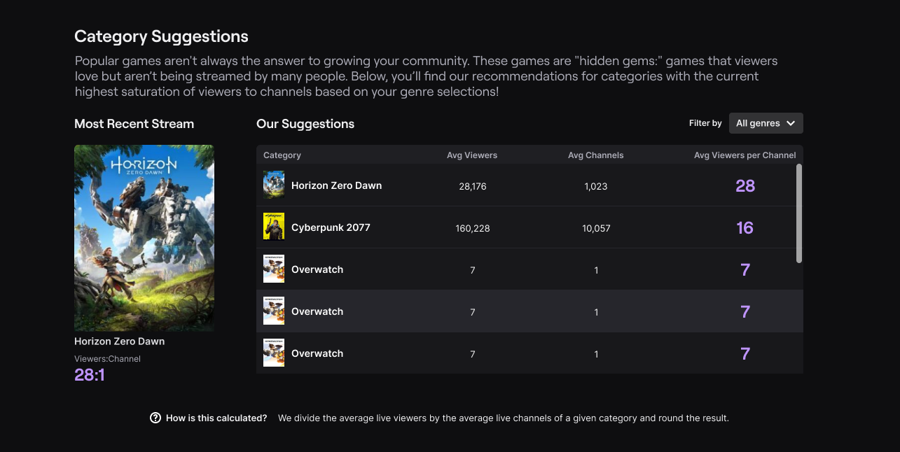
  • Test 1 used vertical bar graphs on the side of each game card as well as the numeric ratio of viewers:channel.
  • Test 2 showed the most recently streamed category in a card, and then a table view of related categories ordered by highest viewer saturation to lowest.
  • Test 3 presented only numeric values, but also exposed the number of viewers and number of live channels alongside the ratio of average viewers per channel.

Test 1 used vertical bar graphs on the side of each game card as well as the numeric ratio of viewers:channel. Test 2 showed the most recently streamed category in a card, and then a table view of related categories ordered by highest viewer saturation to lowest. Test 3 showed only numeric values, but also exposed the number of viewers and number of live channels alongside the ratio of average viewers per channel.
Three concepts with various means of showcasing the user's most recently streamed category and its performance, and an explorable view of related categories and their average viewer saturation.

Feasibility Consult

Users overwhelmingly gravitated towards Test 3, so we decided to push forward with that concept. Before our design sprint, however, we conducted a series of feasibility studies with our engineering partners to learn what was possible and not within this space. These studies resulted in the following product requirements:

  • Due to a lack of front-end resources, we were unable to use any kind of data visualization on the cards
  • We were required to move forward with the card carousel, as it had been partially developed already. Changing to a table format was out of scope
  • The “Most Recent” card created added complexity for user education, as we could only pull their last streamed category on the back-end
    • This was especially true for variety streamers who would only see the last game they played, even if they played a few games over their entire last stream
  • Due to technical limitations, we could only filter by one genre at a time, but we could add a filter for broadcast language

We also received ample feedback from users during user testing which drove a list of design stories for the project, including (but not limited to):

  • Users understood the metric best when we presented it as “Viewers:Channel” - no need for long explanations or on-screen division.
    • Users felt overwhelmed when we presented too much information, especially in terms of redundancy
  • Users often enjoyed browsing far beyond our original plan of 10 total cards, so we removed limitations on the number of cards in the carousel

Design Sprint

With the above feedback, I had a pretty clear idea of how to finalize the design, and was able to focus on refining the front-end experience through further explorations of how the ratio was displayed:
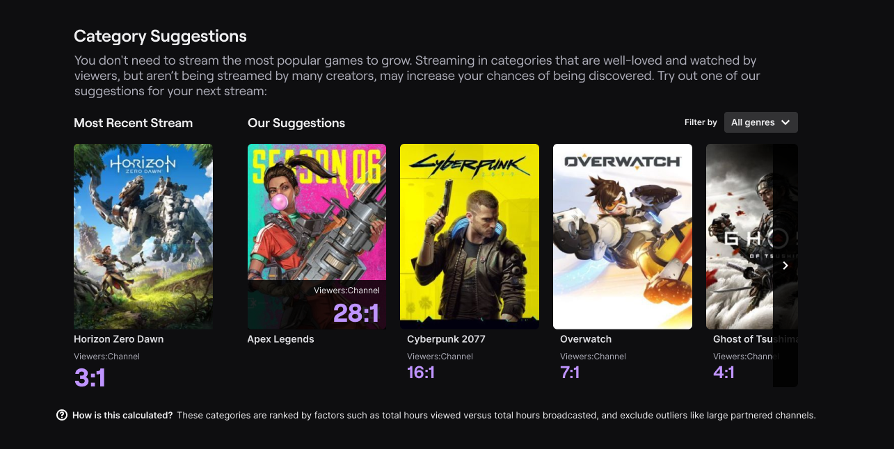
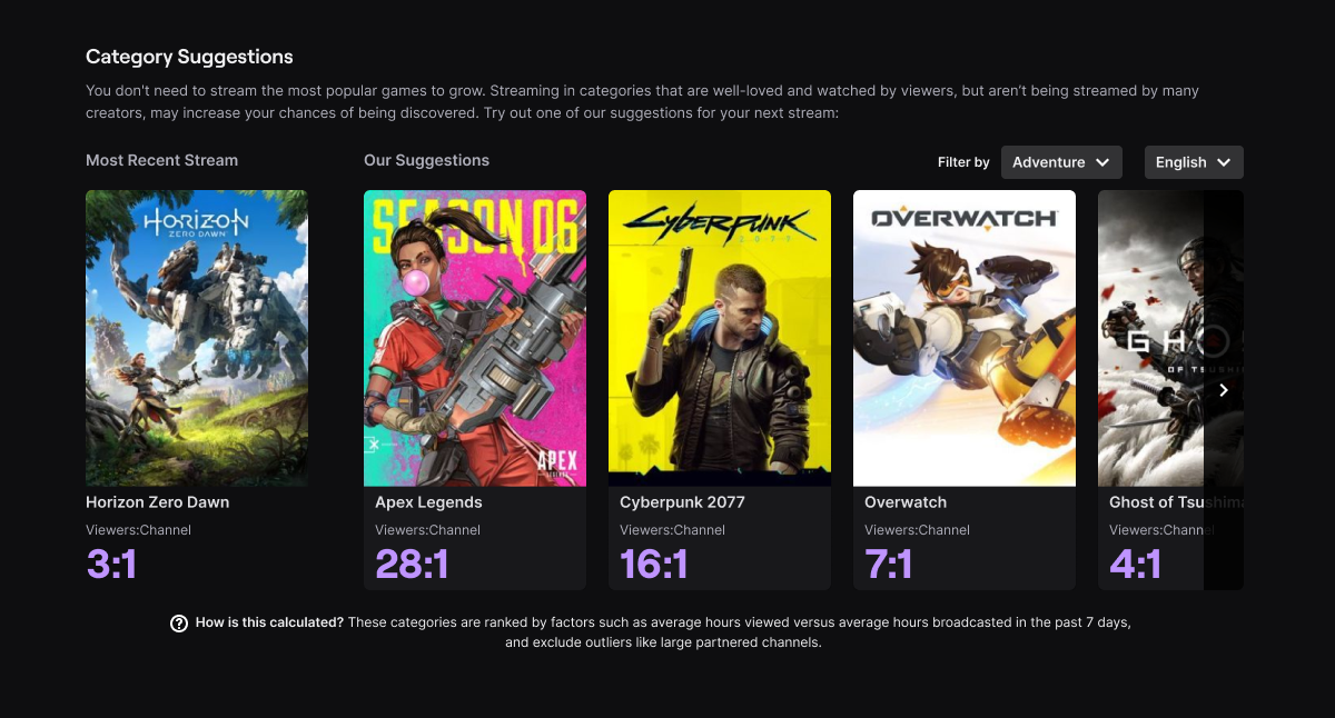
A mockup showing different explorations of diaplaying the viewer:channel ratio in and around the card.
Explorations of the ratio being shown in and around the card in different ways.

Testing & Release

The Final Experience

Below is the final experience - following numerous rounds of feedback and testing - in context of the page it would be present on, called Stream Summary. This page is the summary of a user’s past broadcasts, which they may navigate at the top. Each page shows the user core performance analytics, and the Category Suggestions module was featured prominently in the first module position below the header metrics.
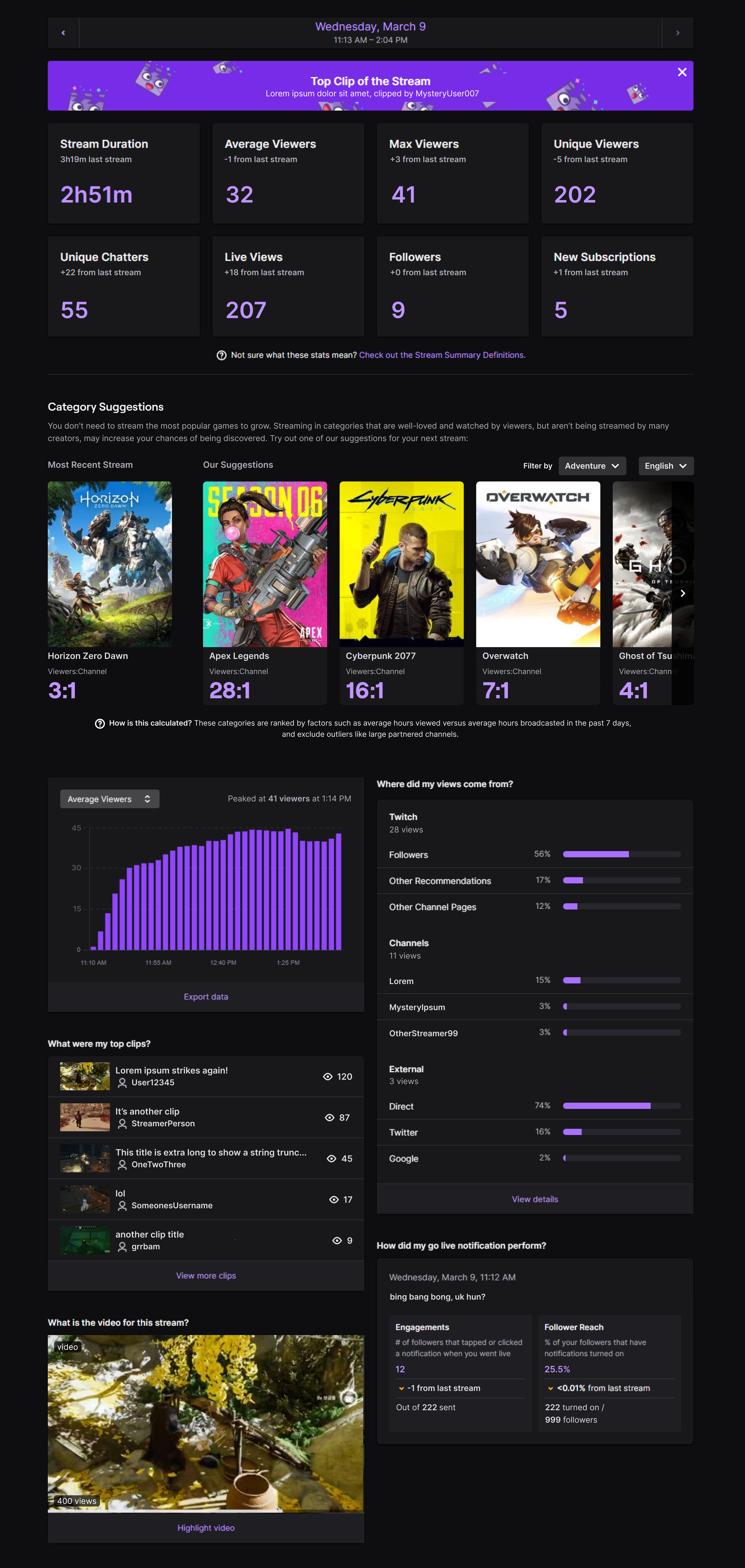
The full stream summary experience, with Category Suggestions prominently near the top of the page.
The Stream Summary page, with the final version of Category Suggestions near the top.

V1 Outcomes

The V1 experiment ran for 1.5 months, targeting a subset of new and up-and-coming creators that accounted for 33% of total creators. We saw statistically significant results on all our primary metrics, including:

  • Stream Summary return visits: +40 bps
  • Significant increases on Stream Summary CTR: +1175 bps
  • Suggested games streamed within 7 days: +62 bps

Due to its success, the tool was gradually rolled out to 100% of all creators!

Looking Forward

The release of this project coincided with my departure from Twitch, but not before my team and I had created a proposal for future developments and improvements that we were unable to scope for the V1. This included the addition of more category metrics, data visualizations for trends over time, and the ability to search and pin categories, or sort by games the creator owns.
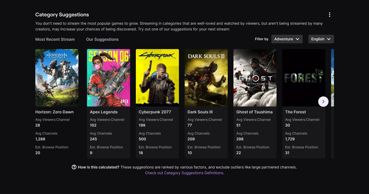
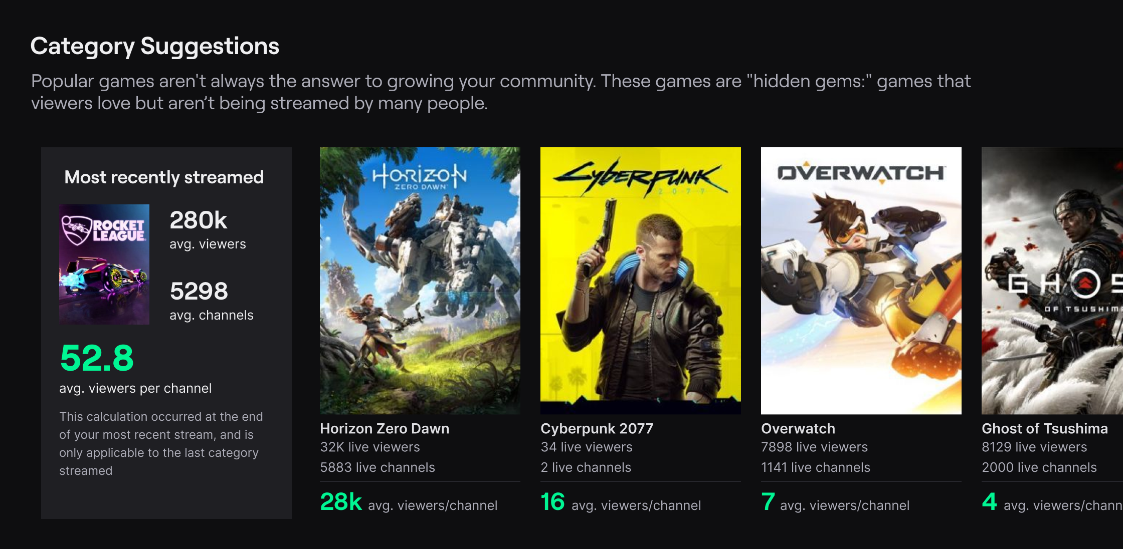
A future concept for Category Suggestions with additional metrics displayed.
A future concept of Category Suggestions with additional metrics and further configurations available.
× Full size image