HNA Group IFE

An In-Flight Entertainment rehaul for China's largest privately-owned airline and its 13 subsidiaries.
Aerospace Accessibility Global Customer UX Research & Validation Testing Multiple Form-Factor
VOD Tool Creator Dashboard

Results & impact

My responsibilities: Lead designer, User/UX Researcher & Analyst, Product Manager, Customer Ambassador

Project timeline: Q1 - Q4 2017

77M+
Annual Users
14
Airlines
15h+
In-flight Testing

The challenge

The core need: Create a new IFE suite for HNA Group's airline holdings and their global customers that aligned with their fleet retrofit using state-of-the-art (for the time) hardware.

HNA Group, which owned Hainan Airlines and 13 domestic Chinese airlines, was looking for a new in-flight entertainment system to complement their updated fleet. Thales was providing the tech and hardware, and Hainan Airlines decided to move forward with an in-house design for their suite of systems as well.

This was my first major project at Thales, and one that was certainly unforgettable!

Design process

1
UX & Cultural Research
I needed to deeply research our hardware offerings to understand what was technically feasible on the devices, in addition to learning about Chinese culture to ensure I was addressing our customer's needs with a global perspective.
2
Client Brainstorming & Initial Concepts
I hosted a project kickoff and initial design symposium face to face with our customer in California. We gathered their needs and I created some initial design ideas.
3
Iteration & Release
I iterated on the selected design over many rounds of customer calls, both in-person in China and remotely, and we tested various designs in-flight. These meetings led to our finalized product, which was released on all 14 airlines in 2017!

Research & discovery

Technical Considerations

HNA's retrofit included multiple form-factors depending on the class of seating. These included:

  • FIT: The first of Thales' screens that supported HD content. This device was the typical seatback screen, and had a resolution of 1920x1080
  • G4: A separate tablet for Business and First Class customers that was available in addition smaller seatback screen. It was larger than the FIT but had a resolution of 1280x800
  • TPMU: A handheld device using the base hardware of the HTC One mobile phone. All seating classes were equipped with these in addition to the seatback screen.

I needed to make a fair amount of technical considerations based on the hardware, including (but not limited to):

  • Each piece of hardware needed to complement each other in control schema and state while remaining usable separately.
    • For example, a user in First class was meant to be able to control the FIT remotely using the TPMU, while ordering a drink on the G4 Tablet. They could then choose to dock the TMPU to deactivate it, and use the G4 as the remote control for the FIT screen.
    • In economy class, customers were meant to be able to use the TMPU as both a controller for the FIT and as a separate device
  • Due to FAA regulations for weight and fire safety, none of the hardware contained a dedicated GPU to process effects or animations.
    • We would need to work with our content teams to coordinate which content (movie posters, album covers, and even text) would require baked-in drop shadows for contrast. This also needed to consider localization needs for all types of content.
    • Animations had to be rendered on the CPU, so we were limited to simple, quick animations.
  • Each individual airline changed their content catalog monthly, so my designs needed to be flexible and dynamic to all types of content (or lack of content) month-by-month.
    • Every hero image would need a placeholder in case of an error or missing content.
    • Some months might not have featured content, so the system needed to be dynamic and show/hide sections as needed.

UX & Cultural Research

Beyond Hainan Airlines, HNA Group’s international airline, the holding group would be porting this interface to all 13 domestic subsidiaries, including Deer Jet, Beijing Capital Airlines, and Lucky Air. This was a culture I had no real prior experience navigating within, but was excited by the opportunity to listen and learn! Overall, the customer base for this airline would comprise of:

  • 95% domestic Chinese
    • The GUI would need to be reflective of cultural norms and practices
      • Red and gold were calming and familiar to this audience
      • The GUI would need to be flexible using Chinese characters in both a horizontal and vertical format
  • 5% foreign nationals
    • The GUI would need to be dynamic to a user’s country of origin, including censorship laws and various content prioritization
    • The interface also needed to support 12 languages and their respective alphabets, including Mandarin and Cantonese, English, Russian, and Arabic, and be dynamic to the needs of each
      • For example, users of Arabic would expect a right-to-left layout for not just text, but interactions and flows as well

My solution

Client Brainstorming & Initial Concepts

Project kickoff comprised of initial client brainstorming sessions, where they dictated their needs in terms of content, look and feel, and technical backend. The clients expressed wanting a few options to select from, so I began work on three concepts with slightly different content needs and structures:

Expedition

This concept used the destination to add visual interest and excitement to the GUI, with overlays displaying helping add contrast to the body and nav elements.
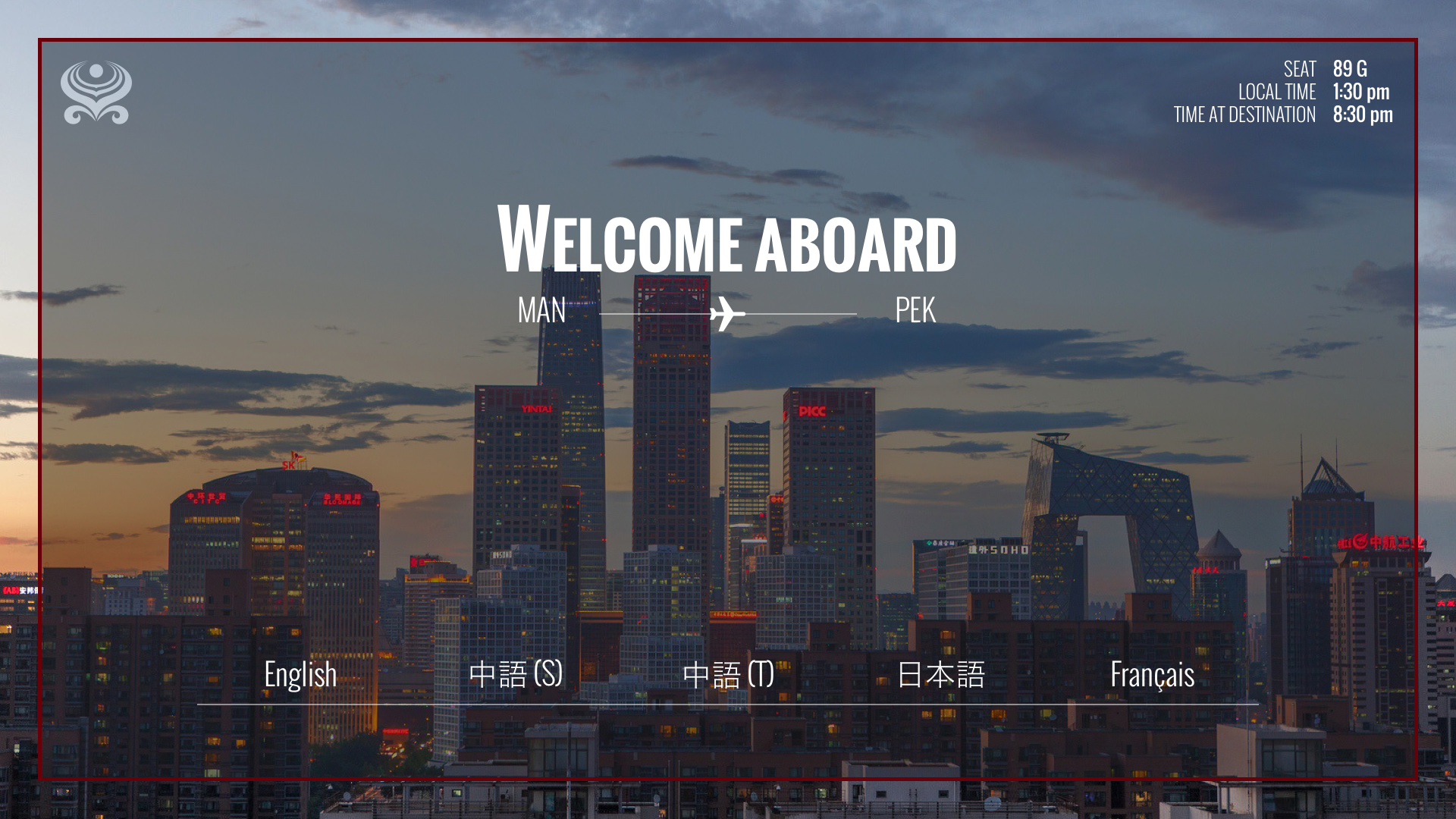
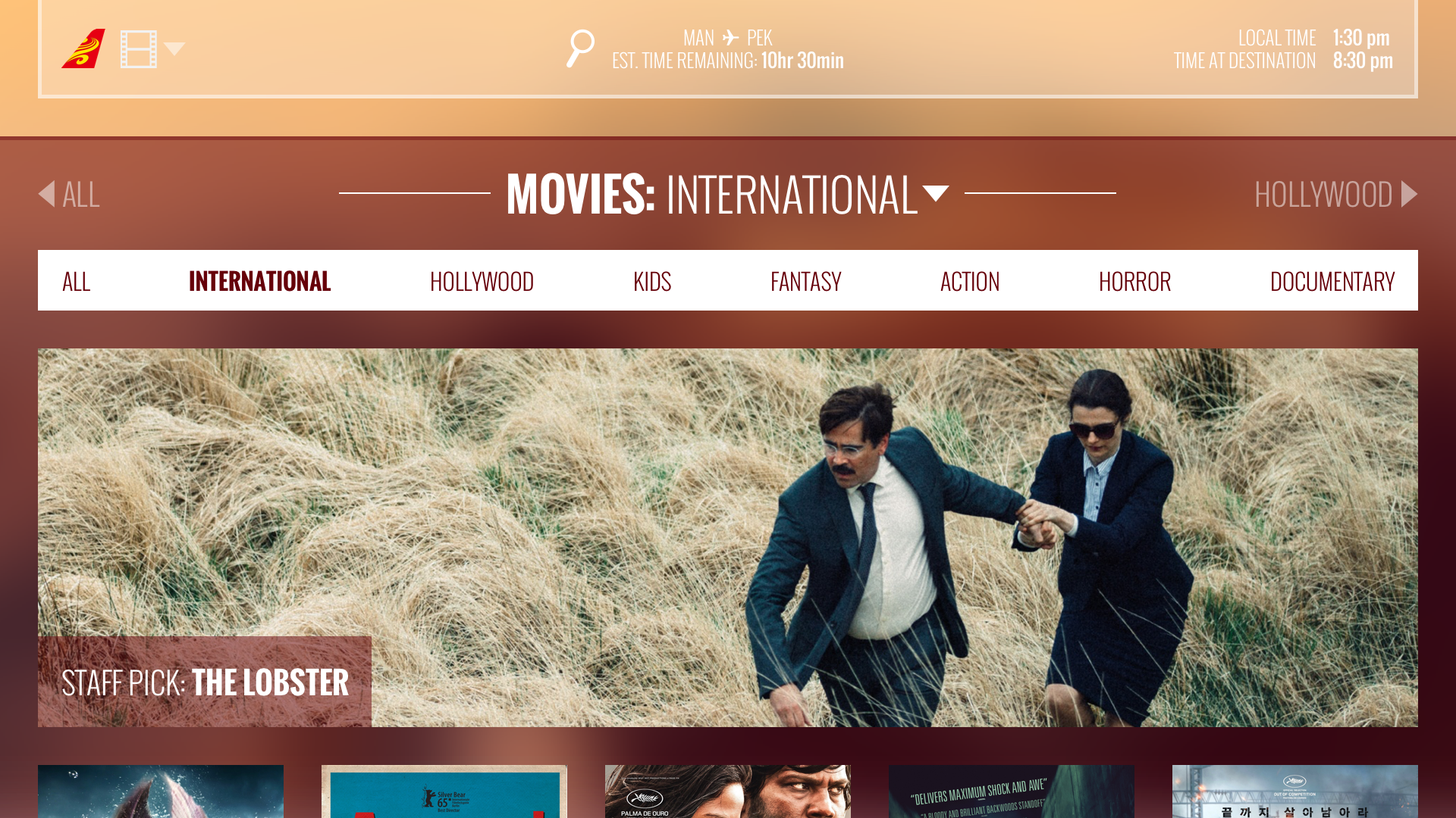
The starting screen, showing an image of Beijing with a 'Welcome aboard' overlay on top of it. The movies page of the IFE, showing a hero image of the staff pick, 'The Lobster,' and the other movies listed below. Sorting is at the top.
"Expedition" concept images. This design used overlays on destination images to convey a feeling of exploration.

Metro

This concept was an attempt at a bold, contemporary, and minimalist look and feel, with a contextual nav system that stacked as you explored. In this way, the user always had access to quickly navigate to anywhere in the GUI.
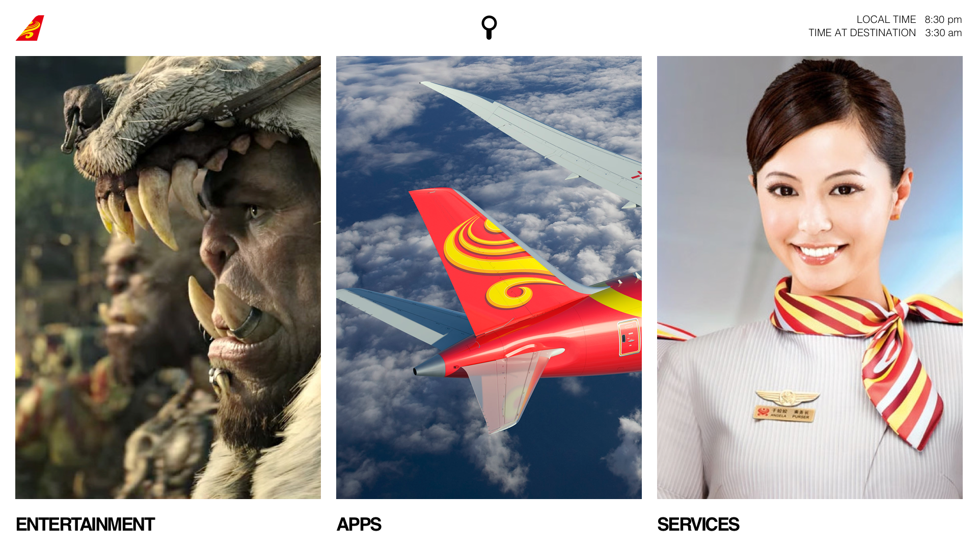
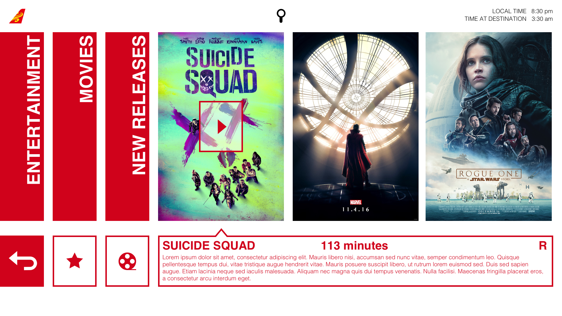
The home menu with 3 cards - entertainment, apps, and services. The design is minimalist, with a simple header nav showing the airline logo and local/destination time. The movie listing. There are three breadcrumb nav columns to the left and movie browsing on the right.
"Sojourn used a bold red and simple blocks of content to remain minimalist and industrial-feeling.

Sojourn

The last of the three concepts, Sojourn used HNA's content library to its fullest potential, with each screen using high-res hero images to wow users. Text and navigation was simple and clean, and even used as an artistic element on each main page. Simple animations confirmed user input on the touchscreen.
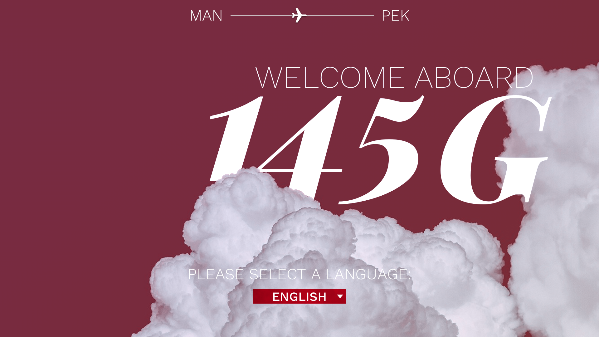
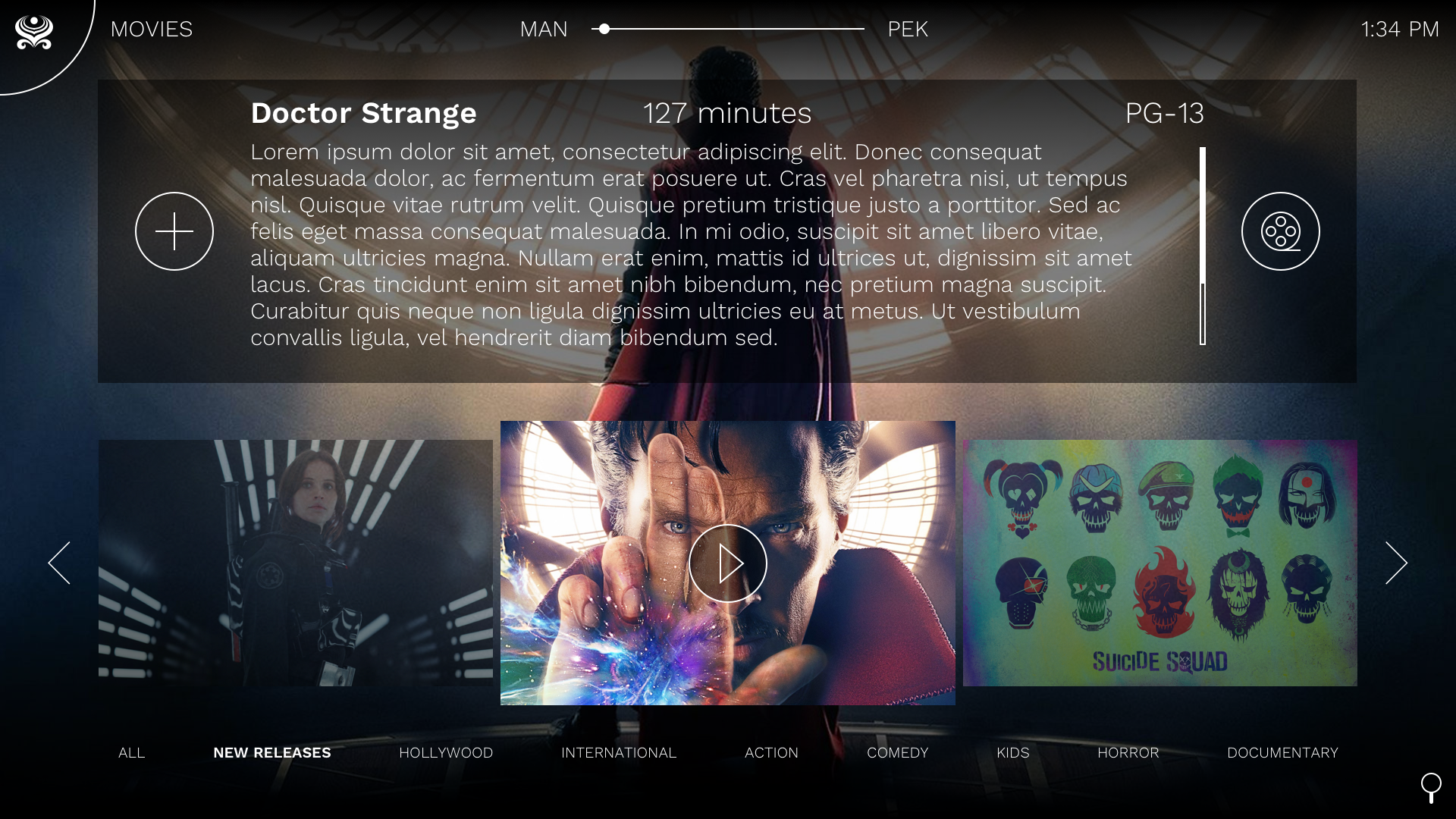
The home menu with 3 cards - entertainment, apps, and services. The design is minimalist, with a simple header nav showing the airline logo and local/destination time. The movie listing. There are three breadcrumb nav columns to the left and movie browsing on the right.
"Sojourn used a bold red and simple blocks of content to remain minimalist and industrial-feeling.

Iteration & Release

Design Evolution

And the winner was…Sojourn!

HNA Group’s content library was their main investment for this interface, and Sojourn allowed them to fully capitalize on the various thumbnails, trailers, screenshots, and product images on a high-def screen. With the main design now selected, I began iterating on the initial concepts to come up with the overall IA and map out each user flow within this system for all 3 devices, including a new Kids Mode that contained parental controls and a separate, simplified interface for children.

This exercise also accounted for statefulness between each device, as the TPMU could be used both on its own and as a controller for the tablet and seat-back screen. As such, I constructed a complex user flow document and began designing each page.

Note: In the mapping below, the “Services” section and it’s contents were deprioritized during the final round of approvals.
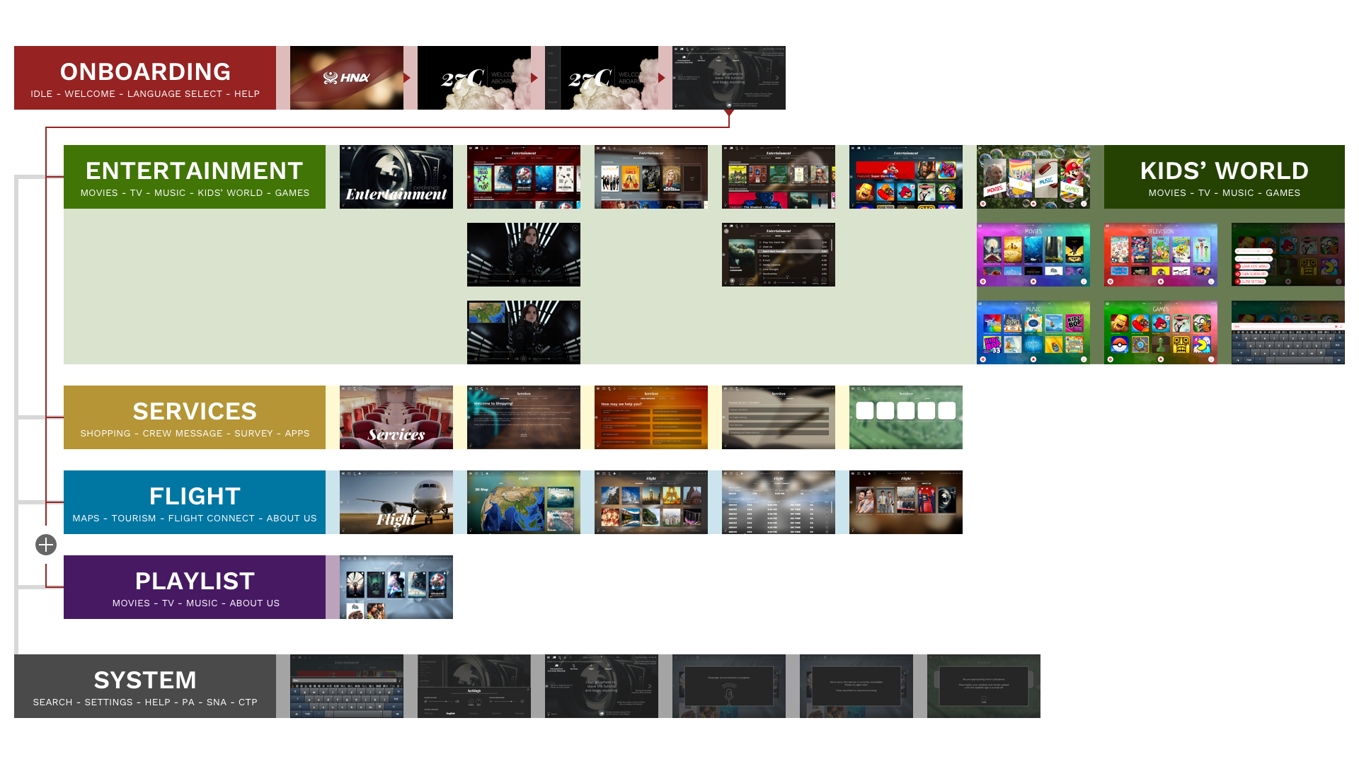
The IA mapping for the new design, showing how each page and section is connected.
The IA mapping for the new Sojourn design.

Onboarding

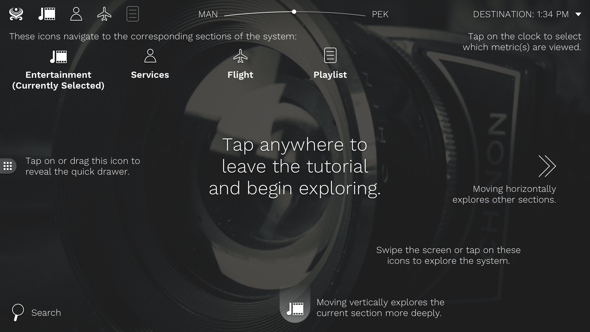
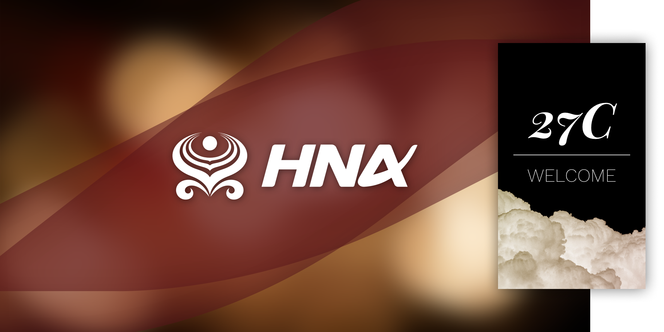
Onboarding encompassed the idle and welcome screens, as well as a Help overlay and language selection.

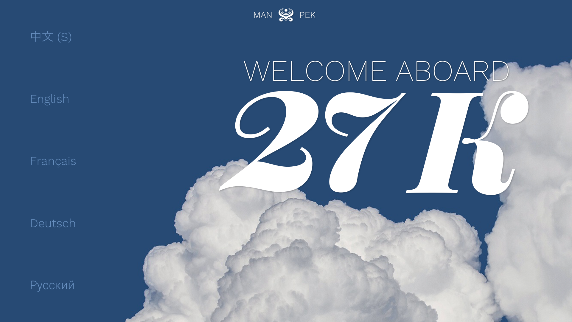
The opening screen of the IFE showing the HNA group logo on a red background with gold bokeh behind it. The welcome screen, with language selection on the left and 'Welcome Aboard' with the seat number peeking through a blue sky with white clouds. The help page overlay, explaining all of he navigation controls.
The final Hainan Airlines onboarding flow.

Entertainment

The entertainment section included movies, TV, music, games, and Kids’ World, which held it’s own movies, music, TV, and game libraries.
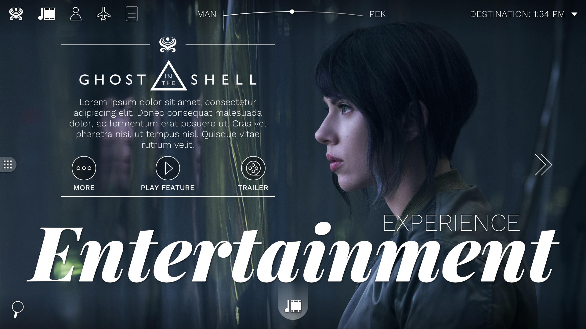
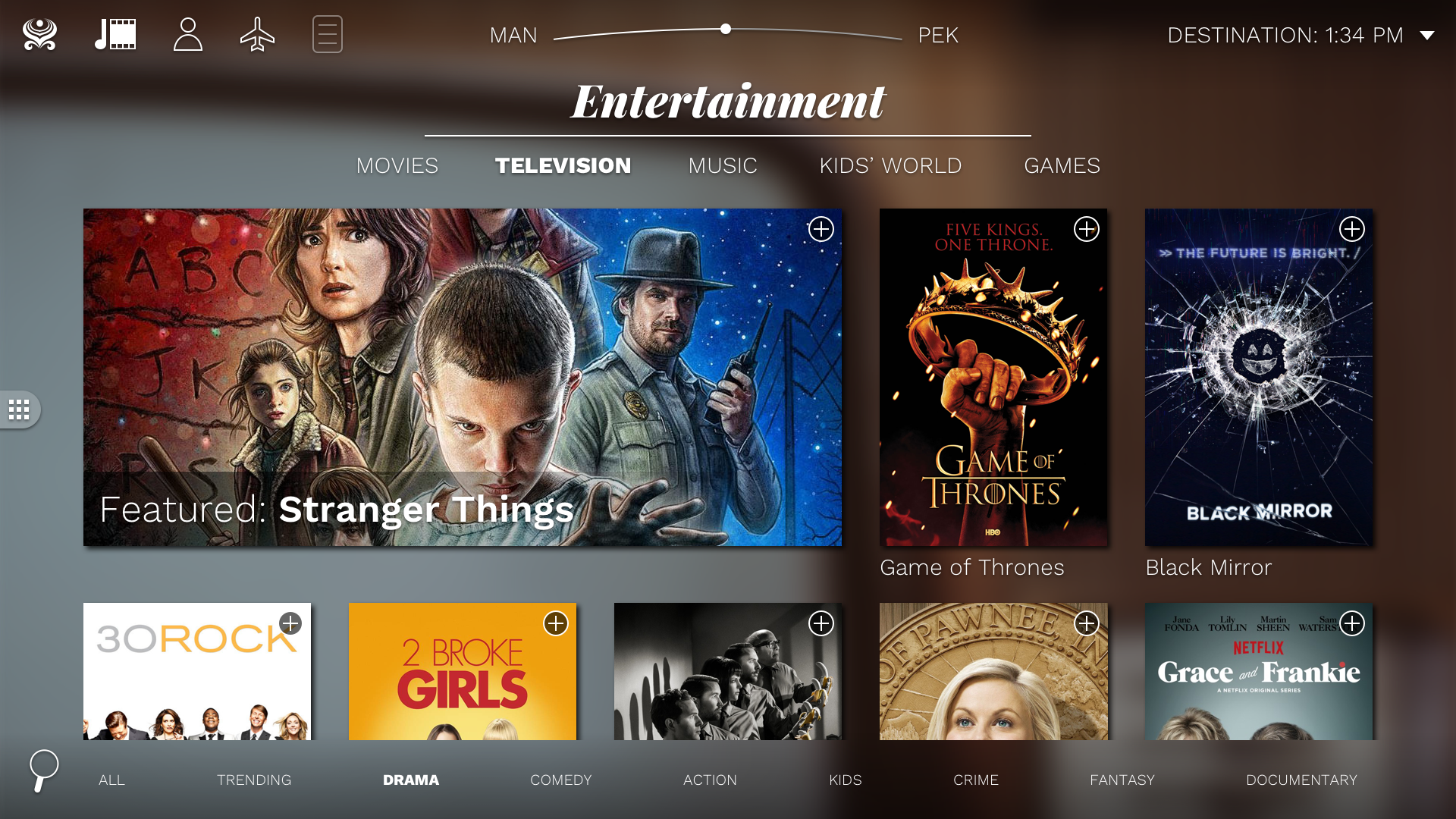
The entertainment home page, with a featured movie - Ghost in the Shell - as a background hero image. The TV show listing page, showing numerous posters the user may scroll through. Sorting controls are at the bottom of the page.
The entertainment home and TV listing pages with featured content.

Flight

Flight contained the interactive Maps product, as well as connecting flight info, tourism videos, and various About Us content.
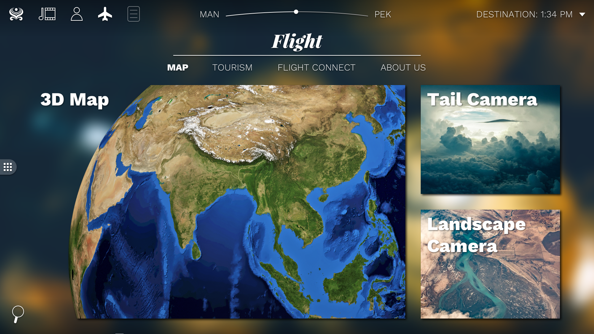
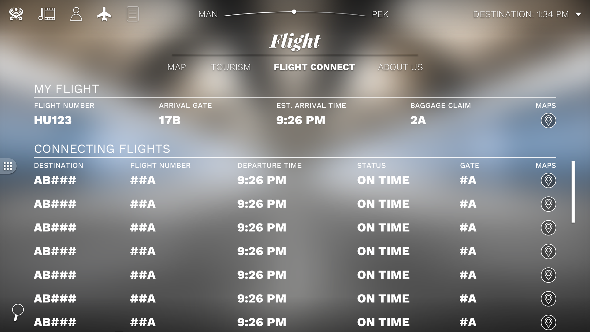
The 3d map screen within the Flight section. There are options to view the 3d map, the tail camera, and the landscape camera. The connecting flight info page within the Flight section. There is a table showing the current flight, and a list of all conecting flights and their associated information.
Flight section screens of the 3d map and connecting flight information.

Playlist

Users could add any of the entertainment content to a playlist, allowing them to consolidate movies and shows to watch, music to listen to, and About Us content they were interested in. This was an editable section and users could add or remove content as needed.
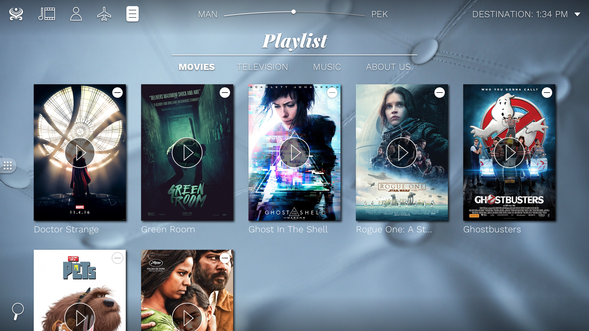
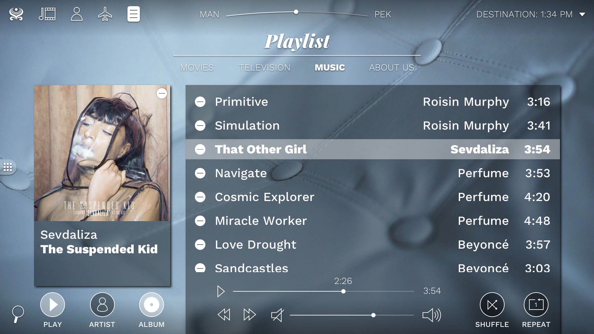
The movie listings within Playlist. A list of movies is shown with the ability to remove them at-will. The music player showing all the user's favorited songs in a table, with the currently playing song's album image and info being shown on the left.
The Movies listing and Music player within the Playlist section.

System

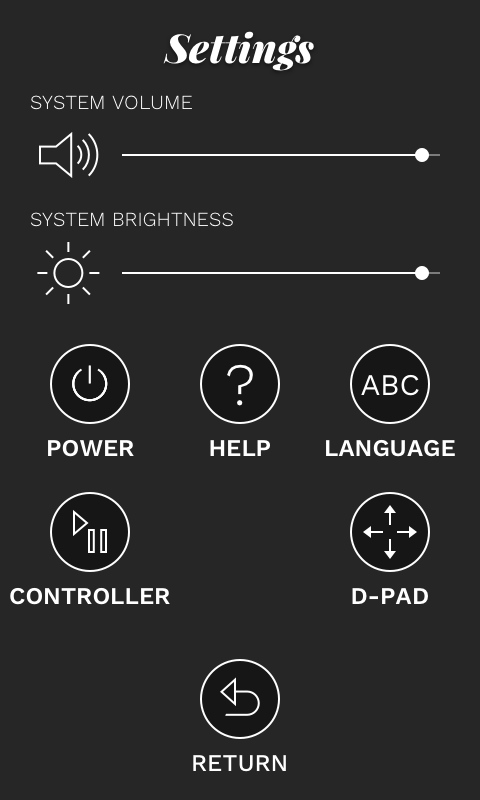
Lastly, the system screens, which included the various Search and Settings pages available from anywhere in the system. Shown below are some of the handheld TPMU control schema, which fell under this category as well.
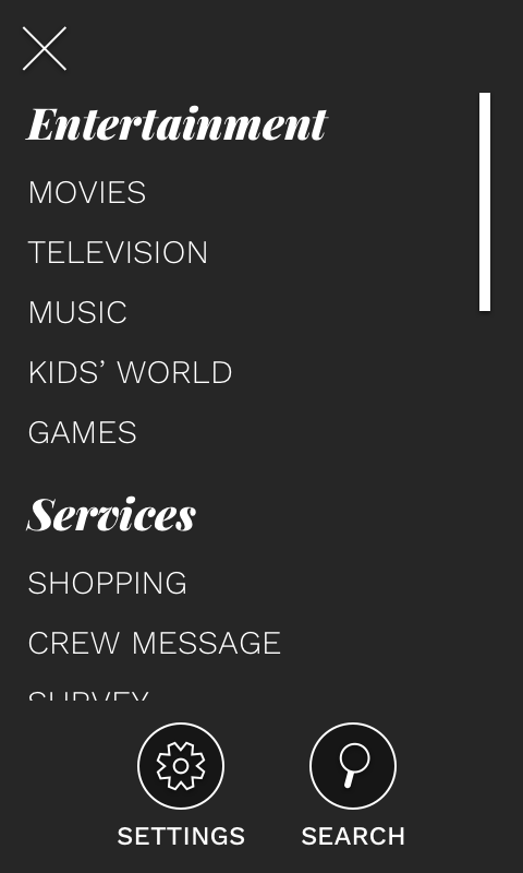
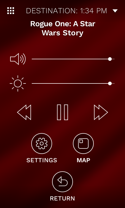
The navigation menu ont he handheld device. The movie controls on the handheld device. The settings on the handheld device.
Various system screens shown on the TPMU device form-factor.
× Full size image